
Every font belongs to a family of shapes, and there are six that account for almost everything you will meet: serif, sans-serif, slab serif, script, display, and monospace. Knowing which is which is the fastest way to narrow a font menu of thousands down to a handful.
This guide covers each category, what it is actually for, how the six behave differently once cut or engraved, real signs that show them in use, and how to pick and test one for a project.
Set your text in any fontType your words, pick a style, and export cut-ready lettering — free.Try the generatorKey Takeaways
- The six categories are serif, sans-serif, slab serif, script, display, and monospace.
- Serifs are the small strokes at the ends of letters; sans-serif means “without” them.
- For cutting, stroke weight matters more than category — thin script and fine serifs are what break.
The Main Font Types
Type is classified by the shape of the letterforms rather than by mood or era. Six categories cover the overwhelming majority of fonts in use.
| Type | Recognise it by | Best for |
|---|---|---|
| Serif | Small strokes at the ends of letters | Long text, tradition, formality |
| Sans-serif | No end strokes; even, clean lines | Screens, signage, modern branding |
| Slab serif | Thick, blocky end strokes | Headlines, sturdy engraving |
| Script | Joined, handwritten strokes | Names, invitations, decorative work |
| Display | Anything unusual or highly styled | Short bursts at large size |
| Monospace | Every character the same width | Code, tables, technical labels |
The first two are the big divide, and most projects start by choosing between them. The other four are specialists you reach for when the job asks for something specific.
Serif Fonts
Serifs are the small finishing strokes at the ends of letters. Garamond, Times, and Baskerville all have them, which is why they read as traditional.

The traditional argument is that serifs guide the eye along a line of text, which is why books have used them for centuries. On screen the advantage disappears at small sizes.
For making, serifs are a liability at small scale. Those fine end strokes are the first thing to burn away when engraving and the first thing to snap when cut.
Sans-Serif Fonts
Sans-serif means without serifs — Helvetica, Futura, Arial. The letterforms are reduced to their essential strokes, which is why they read as modern and neutral.
They dominate screens and signage because they stay legible when small, low-resolution, or seen at speed. Nothing in the letterform depends on fine detail surviving.
That same robustness makes them the safest default for cutting. An even stroke weight means no thin section to fail, and standing letters keep their strength.
Choose by stroke weight, not by category
A bold serif cuts more reliably than a light sans-serif. Before committing, look at the thinnest part of any letter at your finished size — if it is under about 2 mm in wood, expect it to break.
Slab Serif, Script, Display, and Monospace
Slab serif keeps the end strokes but makes them thick and rectangular. Because there are no thin sections anywhere, it is the most forgiving category to cut.
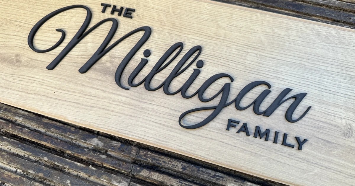
Script imitates handwriting, with letters that join. It suits names and invitations, and it is the hardest to cut cleanly — the joins are thin and the loops trap small offcuts.
Display covers everything designed to be looked at rather than read: stencil, decorative, distressed, three-dimensional. Fine at a large size, unusable in a paragraph.
Monospace gives every character identical width, so columns align. Beyond code it reads as technical, which suits labels, panels, and instrument-style engraving.
Good Font Choices in Real Designs
Five community signs, each leaning on a different category. They are the fastest way to see what a font choice actually does once it is a physical object.
1. Personalized Interlocking Couples Name Sign

Two names interlocked, the first in an upright sans and the second in script running through it. Pairing works here because the two categories are doing different jobs — one holds the structure, the other supplies the flourish. Two scripts would have fought each other.
Get this design →2. Personalized Name Sign

A single name in a flowing script, cut as one connected piece. That connection is the point: because the letters join, the whole word hangs together as one shape, where separate script letters would be too fragile to mount individually.
Get this design →3. Personalized Laser Cut Wooden Floral Name Sign

A rounded display face inside a floral hoop. Display fonts earn their place at exactly this size — one short word, large, where the personality of the letterforms is the design rather than a distraction from it.
Get this design →4. Name Sign For Door

A split monogram, where a heavy serif initial is cut in half so the family name can sit inside it. It only works with a sturdy category: try this with a light serif and the two halves lose the visual weight to frame anything.
Get this design →5. Metal Name Sign
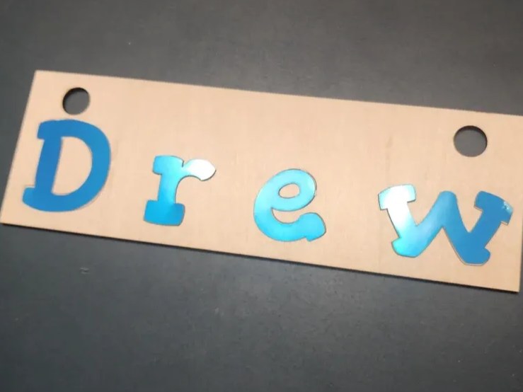
Layered acrylic letters in a chunky display face, spaced along a plain backing bar. Thick, closed letterforms are what make layering practical — each character is rigid enough to be handled, aligned, and glued on its own.
Get this design →How to Choose and Test a Font Type
Narrow by job first, then test at the real size in the real material. The second step is the one people skip.
Step 1: Pick the category by job
Sans-serif for anything read quickly or at small size, serif for formality, slab for headlines, script for names, display for one large word, monospace for technical labels.
Step 2: Set your real text
Type the actual name or phrase into the font generator. Problems live in specific letters — a lowercase “e” that closes up, a capital “W” whose joins get thin.
Step 3: Check the thinnest stroke at final size
Scale to the size you will actually cut and find the narrowest point in any letter. That single measurement predicts whether the piece survives being handled.
Step 4: Export and convert to a cut path
Export the lettering, then trace it to a vector so a machine can follow it — see our walkthrough on converting an image to SVG.
Engrave what you cannot cut
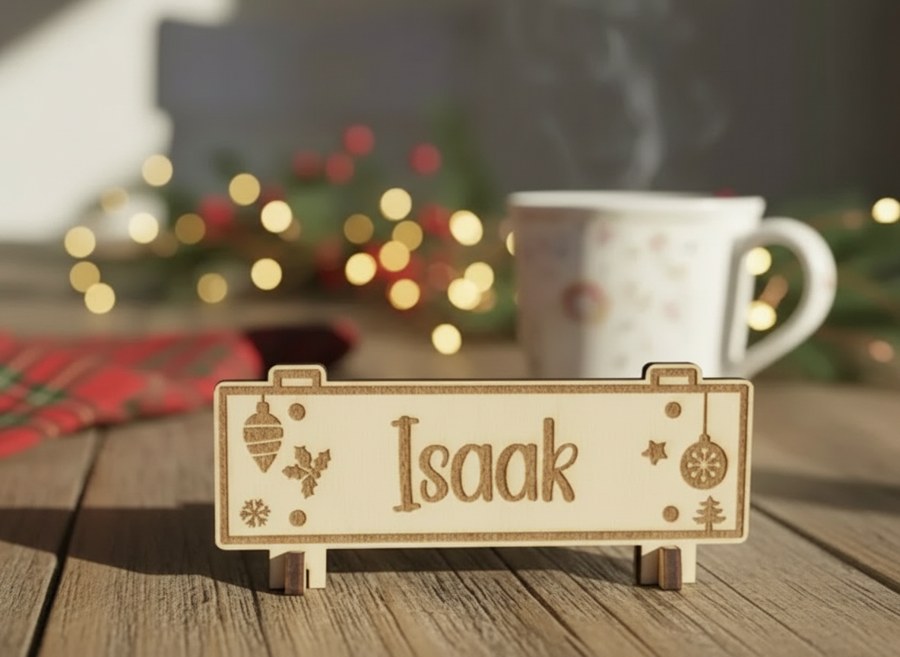
If a font you want has strokes too fine to cut, engrave it into a solid blank instead. Engraving has no minimum stroke width to worry about, so delicate serifs and scripts become available again.
Conclusion
Six categories, and the choice between them is mostly about job rather than taste: sans-serif for legibility, serif for formality, slab for weight, script for names, display for impact, monospace for technical work.
For anything physical, add one more filter on top. Category tells you how the lettering will read; stroke weight tells you whether it will survive. Check the thinnest point before you commit.
If the terminology is still new, start with what a font is, and how a typeface differs from it. For specific picks, see best fonts for logos.
Frequently Asked Questions about Font Types
What are the main types of font?
Serif, sans-serif, slab serif, script, display, and monospace. The classification is based on the shape of the letterforms, particularly whether they have finishing strokes and how the widths vary.
What is the difference between serif and sans-serif?
Serifs are the small strokes at the ends of letters; sans-serif fonts have none. Serifs read as traditional and suit long printed text, while sans-serif reads as modern and holds up better at small sizes.
Which font type is best for laser cutting?
Sans-serif and slab serif, because their stroke weight is even and there are no fine details to burn away or snap. Category matters less than the thinnest stroke at your finished size.
When should I use a display font?
For one short phrase at a large size, where the letterforms themselves are the design. Display faces become illegible in body text and at small sizes.
Why does script break when I cut it?
The joins between letters are the thinnest part of the design, and loops can trap small offcuts. Either scale the piece up, choose a heavier script, or engrave it instead of cutting through.
What is a monospace font for?
Any context where characters need to align in columns — code, tables, technical labels. Outside of that it is used deliberately for a technical or mechanical look.
Set your text in the right font
Type your words, pick a style, and export cut-ready lettering free.
