
A typeface is a designed family of letterforms — Helvetica, Garamond, Futura. A font is one specific member of that family, at one weight and one style. The typeface is the design; the font is the file you install.
This guide covers what a typeface actually is, what a family contains, how variable fonts changed the answer, real pieces that show a family being used well, and how to pick one for something you are making.
Set text in any typeface, freeType your words, pick a style, and export cut-ready lettering.Try the generatorKey Takeaways
- A typeface is the design; a font is one instance of it — Garamond is a typeface, Garamond Bold Italic is a font.
- A family bundles weights, widths, and styles that share one skeleton, so they sit together without clashing.
- Variable fonts put an entire family into a single file with adjustable axes, replacing the old one-file-per-weight model.
What Is a Typeface?
A typeface is a coordinated set of letterforms designed to work together — every letter, numeral, and punctuation mark drawn to one consistent logic. Helvetica is a typeface. So is Baskerville.

The design lives in the shapes themselves: how strokes thicken and thin, how curves close, whether terminals are cut straight or angled. Those decisions repeat across every character, which is what makes the set read as one voice.
The word predates computers by four centuries. It referred to the physical metal type a printer owned, cut in one design at one size, which is why so much of the vocabulary still sounds like workshop equipment.
Typeface vs. Font: The Real Difference
The distinction is easiest to hold onto through the metal-type origin, where it was physical rather than conceptual.
| Typeface | Font | |
|---|---|---|
| What it is | A design — the letterforms themselves | One specific instance of that design |
| Example | Futura | Futura Bold Italic |
| In metal type | The design the punchcutter drew | One drawer of sorts: one size, one weight |
| On a computer | The family shown in the menu | The individual file you install |
| Analogy | The song | One specific recording of it |

In practice most people say “font” for both, and no one will misunderstand you. The distinction still matters when you are buying a licence or specifying type, because you pay per font, not per typeface.
For the font side in detail — formats, anatomy, and how to choose one — see our guide to what a font is.
What a Type Family Contains
A family is everything drawn from one skeleton. Four axes account for almost all of it.

Weights
Thin, Light, Regular, Medium, Bold, Black. The skeleton stays constant while the strokes thicken, which is how a family holds together across a hierarchy.
Styles
Roman and italic. A true italic is drawn separately with different letterforms — not the upright design mechanically slanted, which is what software produces when no italic exists.
Widths
Condensed, Normal, Extended. Same weight, different horizontal proportion, useful when a name has to fit a fixed space without shrinking.
Optical sizes
Separate cuts for small text and large display use. Text sizes get more open spacing and sturdier strokes; display sizes get tighter and more delicate.
Why a big family is worth paying for
A fifty-font family means every weight and width you might need is already coordinated. You never have to pair two unrelated designs and hope their proportions agree — which is where most amateur type pairing goes wrong.
Variable Fonts
A variable font collapses the whole family into one file with adjustable axes. Rather than choosing between Bold and Black, you set a weight value anywhere along the range.
The common axes are weight, width, slant, and optical size, though a typeface can define custom ones. Everything in between is generated from the same outlines rather than stored separately.
For web use the saving is obvious — one file instead of a dozen. For making, the value is being able to nudge a weight until strokes are thick enough to survive being cut, without jumping to the next preset.
Typefaces at Work: Real Pieces
Five community signs where the typeface choice, not the layout, is doing the work. Each is a downloadable design.
1. Metal Name Sign
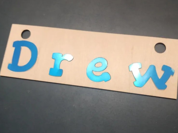
Layered acrylic letters in a heavy display face. The typeface had to be chosen before anything else here, because only a design with thick, closed letterforms produces characters rigid enough to cut, handle, and glue individually.
Get this design →2. Personalized Nature themed name sign

A nature-themed sign setting a name in a soft sans above a second word in spaced capitals. Both come from the same tonal family, so the second line reads as a subtitle rather than as a competing headline.
Get this design →3. Name Sign
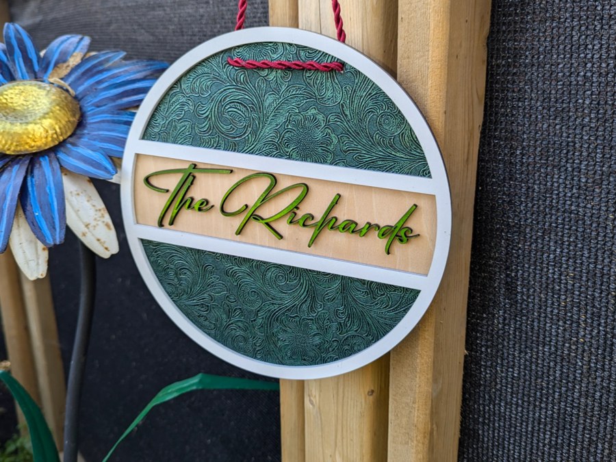
A layered oval plaque with a script name on a contrasting band. The script is set at a single large size with generous spacing, which is exactly the condition a display-optimised cut is drawn for.
Get this design →4. Baby Name Sign - Flowers & Elephant

A nursery sign in a rounded sans with soft terminals. The typeface is doing the tone-setting entirely — strip out the elephant and flowers and the lettering alone still reads as gentle and child-appropriate.
Get this design →5. Personalized Wooden Mailbox with Name Sign
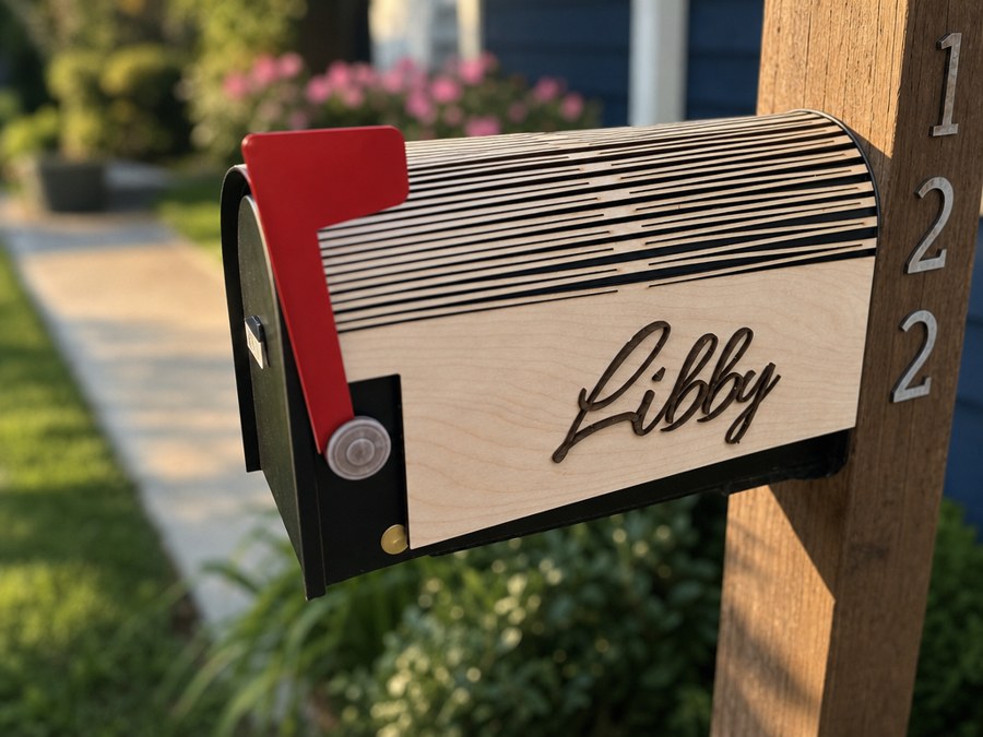
A name in script applied along a mailbox. Outdoors and at distance, a script survives only if the strokes stay thick relative to the viewing distance, which is why this one uses a heavy weight rather than a delicate one.
Get this design →How to Choose a Typeface for a Project
Four steps, working from what the type has to do rather than from what looks appealing in a menu.
Step 1: Decide what the type has to do
A word on a sign, a paragraph on a label, and a monogram on a gift each want different things. Display designs fall apart at small sizes; text designs look weak set large.
Step 2: Check the family has the weights you need
If a design ships in one weight only, you cannot build a hierarchy without pairing it with something else. A family with four or more weights does that work on its own.
Step 3: Test it at the real size and material
Set your actual words in the font generator, not a placeholder. Thin strokes and tight counters that look fine on screen can close up or snap once cut.
Step 4: Confirm the licence covers the use
Desktop, web, and commercial-product licences are sold separately. Selling items with a typeface on them is usually a different licence from designing them.
Conclusion
A typeface is the design and a font is one instance of it. Nobody will correct you for using the words interchangeably, but the distinction becomes practical the moment you buy a licence or specify a weight.
What matters more day to day is the family. Choosing a typeface with enough weights and widths means the hierarchy is already solved, and you never have to gamble on two unrelated designs agreeing.
Next, narrow by category: our breakdown of the six font types covers when to reach for each, and best fonts for t-shirts gives specific picks.
Frequently Asked Questions about Typefaces
What is a typeface?
A designed family of letterforms sharing one visual logic — every character drawn to the same rules. Helvetica, Garamond, and Futura are typefaces; the files you install are fonts of them.
What is the difference between a typeface and a font?
The typeface is the design, the font is one instance of it. Futura is a typeface; Futura Bold Italic is a font. In metal type the distinction was physical, which is where it comes from.
Does the distinction still matter?
Mostly when licensing or specifying type, since you buy per font rather than per typeface. In everyday conversation the two words are used interchangeably and nobody is confused.
What is a type family?
All the fonts of one typeface: the weights, the italics, the condensed and extended widths. They share a skeleton, so they combine without the mismatch you get pairing unrelated designs.
What is a variable font?
One file containing a whole family, with axes you adjust continuously rather than fixed presets. Set weight to any value in the range instead of picking between Bold and Black.
Can I use any typeface on things I sell?
Not automatically. Desktop, web, and commercial-product licences are sold separately, and selling items carrying the lettering usually requires a different licence from designing them.
Set your text in the typeface you want
Type your words, pick a style, and export cut-ready lettering free.
