
Your font is your brand's voice before anyone reads a word. The right one signals trust, modernity, or luxury on sight. Below are the best fonts for branding in 2026, shown in the actual typeface and grouped by personality. Most are free on Google Fonts.

Key Takeaways
- Most brands need just two fonts: a primary for headlines and a secondary for body.
- Match the font's personality to your brand — sans for modern, serif for heritage, rounded for friendly.
- In 2019, the Lucidpress study found consistent branding can raise revenue by up to 33%.
- Nearly all our picks are free on Google Fonts and licensed for commercial use.
What makes a good branding font?
A good branding font fits your brand's personality and stays consistent everywhere. Consistency pays: in 2019, the Lucidpress (now Marq) study found consistent branding can lift revenue by up to 33%. Type also shifts perception — in a 2021 Monotype and Neurons study, the right typeface made a message feel 13% more relevant and 9% more trustworthy. So a brand font is strategy, not decoration.
How to build your brand's font system
- Choose a primary font. Pick one that matches your brand's personality, for headlines and your logo.
- Add a secondary. Use a second font for body text, or lean on one superfamily's weights.
- Set a type scale. Define sizes for headline, subhead, body, and caption.
- Apply it consistently. Use the same fonts and sizes across your site, packaging, social, and print.
- Write it down. Save the fonts and rules in a one-page brand guide.
Best modern sans-serif fonts for branding
Sans-serif reads clean, modern, and trustworthy — the safe default for tech, startups, and most small businesses. In 2026, Google Fonts offered 1,934 free families (per Google Fonts data).
Work Sans
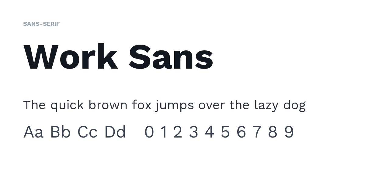
Clean, functional, and neutral, Work Sans can carry a whole brand system on its own weights. Best for: UI-driven and one-font brands. Pair with: itself, across weights. Free on Google Fonts.
DM Sans

A low-contrast geometric-humanist sans, DM Sans reads as "modern tech startup" and stays tidy at small sizes. Best for: tech and startups. Pair with: Lora. Free on Google Fonts.
Lato
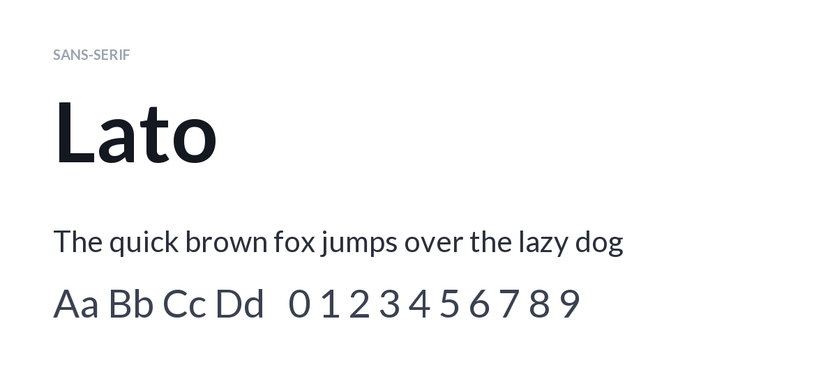
Semi-rounded details give Lato warmth over an otherwise serious sans, making it a safe, versatile primary. Best for: approachable corporate brands. Pair with: Merriweather. Free on Google Fonts.
Libre Franklin

A Franklin Gothic revival, Libre Franklin feels trustworthy and editorial across nine weights. Best for: news, finance, professional services. Pair with: a serif body. Free on Google Fonts.
Best geometric fonts for branding
Geometric sans feel structured, precise, and brand-forward — strong for logos and headlines.
Montserrat

Bold, urban, and confident, Montserrat's geometric caps make excellent logo and headline type. Best for: headlines and logos. Pair with: Lato. Free on Google Fonts.
Poppins

Near-perfect circular geometry makes Poppins feel modern and optimistic. Best for: DTC and lifestyle brands. Pair with: a serif like Lora. Free on Google Fonts.
Raleway

Elegant and refined, Raleway's thin weights give a fashion-forward feel. Best as display, not long body text. Best for: boutique and fashion. Pair with: a plain body sans. Free on Google Fonts.
Best serif fonts for branding
Serif fonts signal heritage, trust, and quality — ideal for finance, publishing, and any brand wanting gravitas.
Merriweather
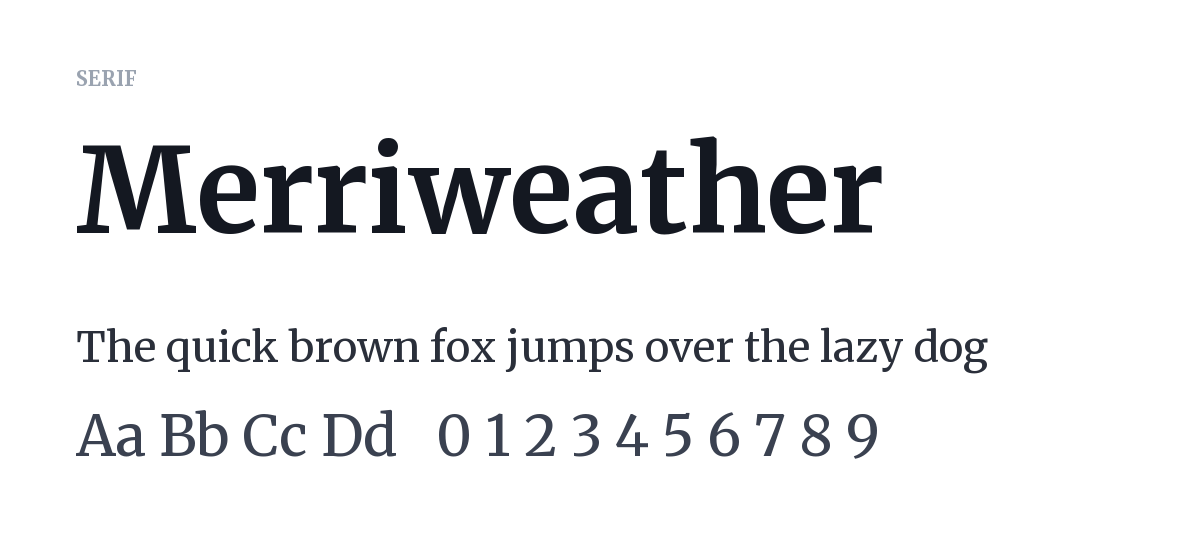
Designed for screens, Merriweather's sturdy serifs read as dependable and established. Best for: finance, B2B, and body text. Pair with: Work Sans. Free on Google Fonts.
Lora
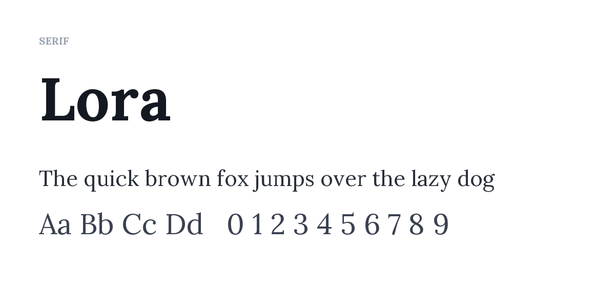
A brushed-curve serif, Lora feels modern yet literary and calm. Best for: wellness, editorial, and considered brands. Pair with: DM Sans. Free on Google Fonts.
EB Garamond

An open-source Garamond revival, EB Garamond conveys craft and heritage — a free stand-in for licensed Garamond. Best for: heritage and craft brands. Pair with: a clean sans. Free on Google Fonts.
Best luxury and display fonts for branding
High-contrast display serifs read premium and editorial. Use them for headlines and logos, not body text.
Playfair Display
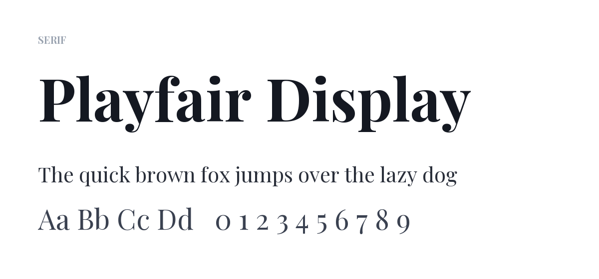
High-contrast thick-and-thin strokes give Playfair Display a Vogue-style elegance — the go-to free luxury headline serif. Best for: fashion, beauty, hospitality. Pair with: Montserrat. Free on Google Fonts.
Cormorant Garamond

Extremely fine and high-contrast, Cormorant Garamond is delicate and aspirational. Beautiful large; keep it off small body text. Best for: high-end, elegant brands. Pair with: Raleway. Free on Google Fonts.
Best friendly, rounded fonts for branding
Rounded fonts feel warm and human — great for kids, food, wellness, and community brands.
Nunito

Rounded terminals make Nunito read friendly and non-corporate. Best for: wellness, food, and community brands. Pair with: a neutral sans. Free on Google Fonts.
Quicksand

Geometric with rounded corners, Quicksand is fun and clean for casual and craft brands. Best as display, not dense body. Best for: craft and maker brands. Pair with: a plain sans. Free on Google Fonts.
Two paid classics worth knowing
Futura (the timeless geometric behind Louis Vuitton and Nike) and metal-lineage Garamond aren't free. If the budget isn't there, Poppins or Jost stand in for Futura's geometry, and EB Garamond covers classic Garamond.
What are the best font pairings for branding?
The safest rule is contrast — match a distinctive font with a plain one. Four proven, all-free combinations:
- Playfair Display + Montserrat — elegant serif headlines over a clean sans. Fashion and lifestyle.
- Montserrat + Lato — confident caps over a warm body sans. A safe all-purpose combo.
- Merriweather + Work Sans — a trustworthy serif with a neutral sans. Finance and B2B.
- DM Sans + Lora — modern sans over a soft serif. Wellness and content brands.
How to design your brand type with a font
Chosen your brand fonts? Atomm's AI Font Generator turns them into custom lettering for your wordmark and marks — no design software needed.
Create your lettering. Open the generator and upload a style reference, or describe the look you want.

Generate your brand words. Type your brand name or tagline, and the AI builds matching lettering.
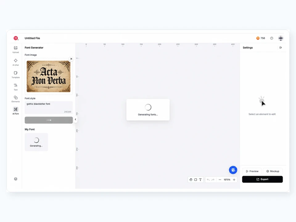
Refine and download. Adjust the weight and spacing on the canvas, then download it.

Apply it across your brand. Use the lettering on your logo, packaging, and social.
Design a font now
Free to generate & export
Turning your type into a logo? See the best fonts for logos. Putting it on merch? Try the best fonts for t-shirts.
Monogram and lettering ideas from the Atomm community
Brand marks often start as a monogram or wordmark. Here are real letter-based designs to spark ideas.
Floral Monogram Pouch
Get this design free
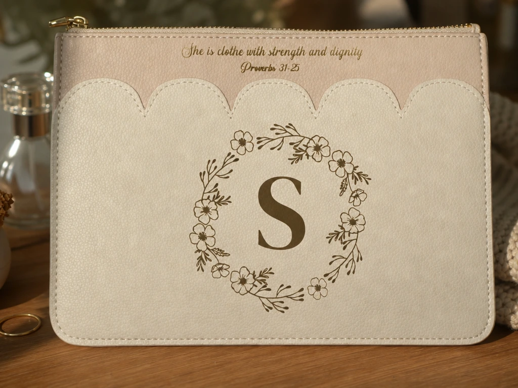
A two-letter floral monogram on a zippered pouch. It shows how a simple lettered mark becomes a consistent brand element across products.
Monogram Photo-Album Patch
Get this design free
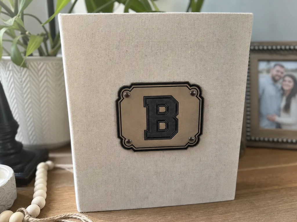
A monogram patch applied to an album cover. A lettered badge like this is the simplest way to turn a plain product into a branded one.
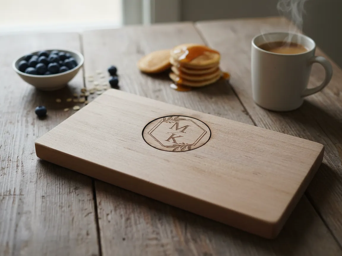
Monogram Serving Board
Get this design free
Clean initials engraved on a serving board. Simple, well-set letterforms make a premium, ownable mark — the foundation of a brand identity.
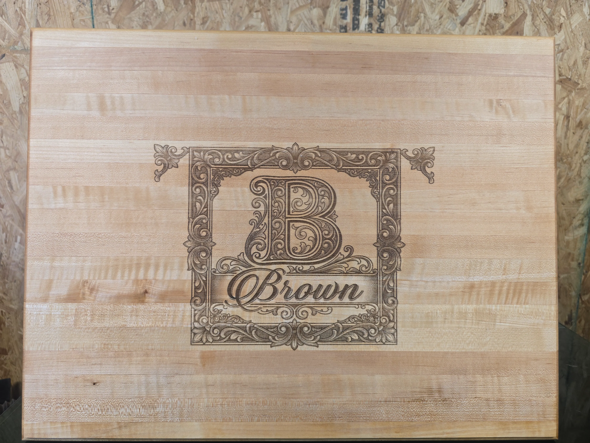
Family Name Board
Get this design free
A monogram paired with a family name. Combining an initial with a wordmark is exactly how real brand lockups are built.
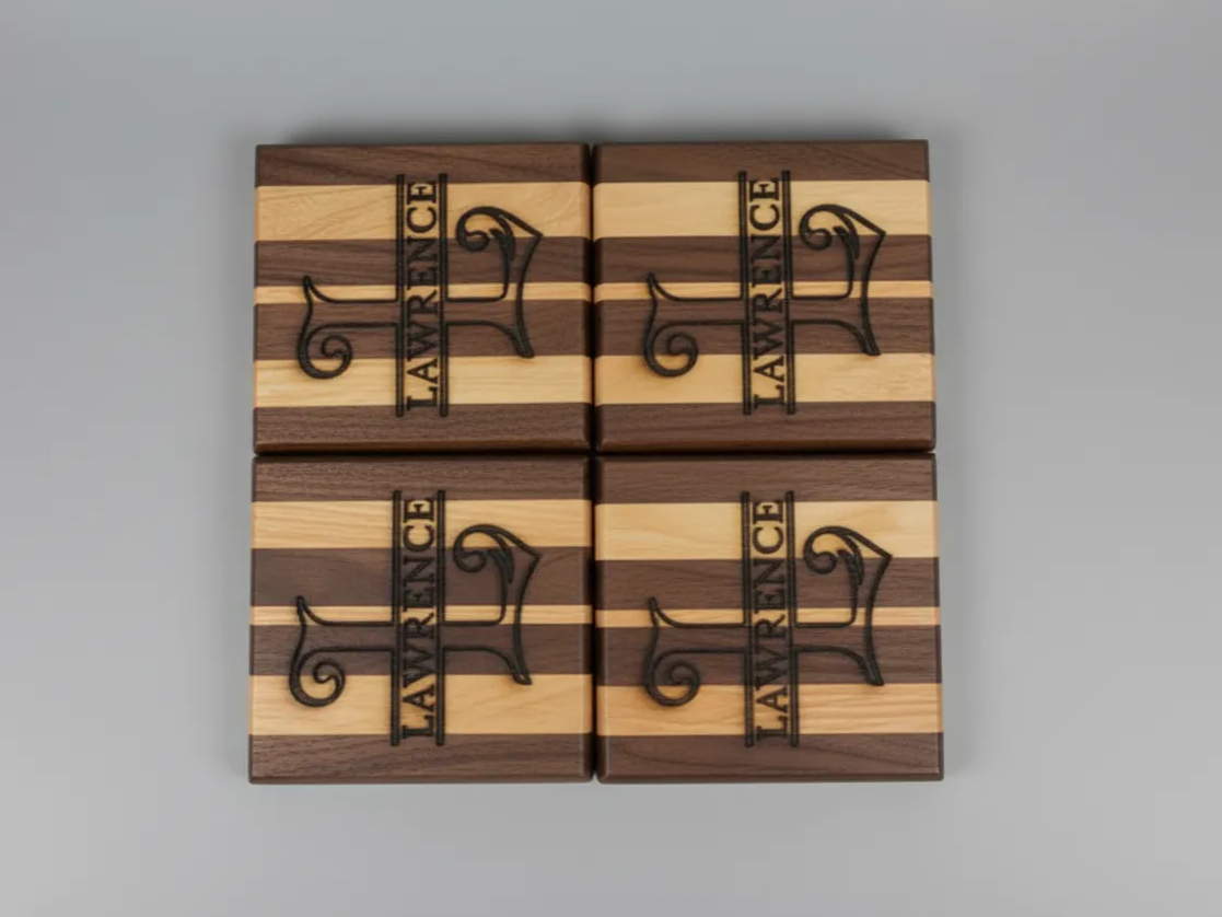
Personalized Coaster Set
Get this design free
A matching coaster set with consistent lettering. Repeating one typeface across a set is exactly how brand collateral builds recognition.
Name + Icon Board

Get this design free
A name paired with a simple mountain icon. Wordmark plus symbol is the essence of a logo lockup — and it starts with the right font.
Frequently Asked Questions
What is the best font for branding?
There's no universal winner, but Montserrat is the most versatile — geometric, professional, and free on Google Fonts. Pair it with a serif like Playfair Display for contrast. The best choice is the one whose personality matches your brand and audience.
How many fonts should a brand use?
Two is ideal: a primary for headlines and logos, and a secondary for body text. A single superfamily with many weights can also cover a whole brand. Using more than three fonts weakens recognition and looks unprofessional.
Are these branding fonts free?
Almost all are. Nearly every pick here is free on Google Fonts under open licenses that allow commercial use, including logos. Only Futura and metal-lineage Garamond need a paid license, and both have free stand-ins like Poppins and EB Garamond.
Does the font really affect how people see my brand?
Yes. In a 2021 Monotype and Neurons study, the right typeface made a message 13% more relevant, 10% more memorable, and 9% more trustworthy. Consistent branding, typography included, can raise revenue by up to 33% (Lucidpress, 2019).
What font pairing looks most professional?
Merriweather with Work Sans is a reliably professional pairing — a trustworthy serif headline over a clean, neutral body sans. For something more premium, try Playfair Display with Montserrat. Both combinations are free and widely used by real brands.
Conclusion
The best branding font fits your brand's personality and stays consistent everywhere. Choose a primary that sets the tone — a modern sans, a heritage serif, a luxury display, or a friendly rounded face — and pair it with a plain secondary. Keep it to two fonts, apply them consistently, and your typography will work quietly for the brand every day.
